COLOUR + ARCHITECTURE
The Arei Designs team discovered an article by the talented team at BSBG Media Team. We found the words not only informative, but inspiring to read when it came to the topic of understanding the psychology of colour.
The ability to understand the emotive impact and psychology of colour is something all designers retain a focus on within their work; and not only those working in architecture or interior design – all creative and artistic fields require knowledge of colour.
Full article below… we hope you enjoy this as much as we did!
HUMAN PERCEPTION OF COLOUR AND ARCHITECTURE
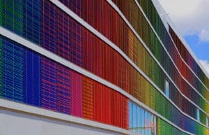
Over the course of the last century, it has been proven many times over through empirical studies that human perception of architectural space is predominantly driven by colour. Colour is total, and affects humans both psychologically and physiologically. The effects colour has on our impression of architecture are numerous; playing on associative, symbolic, emotional and synesthetic perceptions. These perceptions will ultimately drive the goal of the design, particularly where incorporation of colour is concerned, and where there is potential for a certain psychological mood or ambiance to be created in support of the primary function of the space.
An architectural designer considers the impact of colour on each component of a project, both externally – in the selection of wood, natural stone, bricks, GRC, and within interiors – where there is scope for incorporation of the aforementioned materials, mixed with expressions of colour by using paint, furniture, decorative features and elements.
Through design, the modern aspiration is to achieve the correct outcome for the experience of the space, and to produce the best possibility for a feeling of comfort and wellbeing in the end user. Colour selection plays an integral role here, for example within creative spaces, where brighter, more vibrant colours serve to enhance the feeling of motivation in the end user; in hospitality projects, where colours are chosen to complement respective targets for relaxation, lavish exuberance or boutique charm; and in multi-purpose buildings, where colours can be used to provide separation of different areas that serve contrasting functions.
PSYCHOLOGY OF COLOUR
International research and studies have found colour interpretation to be a visual language that all can speak: male, female, adult or child, across every nationality and from every cultural background. Different colours carry different messages, but each delivers its own psychological effect in the same way, no matter the audience. Human response to colour is commonly classified into the following categories:

BIOLOGICAL
Physical reaction to colour. For example, tests have shown that people display a lower heart rate in a room coloured blue, and higher in a room decorated in red.
SUBCONSCIOUS
Our perception of colour can sometimes be governed by previous personal experiences. For example, we may develop a dislike for a certain colour based on something or someone negative that came into our lives before.
CONSCIOUS SYMBOLISM ASSOCATION
There are general symbolism associations, such as blue with water, red with heat or fire, yellow with the Sun, and green with grass. But also there are more personalised associations made that can impact our feelings about colour. In fact, fans of certain football teams often express a dislike for the colour adorned by their rivals.
CULTURAL INFLUENCE
There are certain colours that different cultures perceive in quite different ways. A good example here is in the way black and white differentiate in both Western and Eastern cultures. In the West, white is pure and is the choice for bridal gowns, while in the East white symbolises death and is worn to funerals. Black is the colour of health and prosperity in the majority of Eastern nations, while Western civilisations associate black with more sombre situations, adorning the colour in moments of sadness and mourning.
FASHION TRENDS
Trends in colour shift annually, particularly with the influence of the Pantone Colour Institute, which is dedicated to predicting – and often dictating – trends in colour. These continual trends do not really impact an architect or interior designer’s approach to colour though, as quickly shifting trends don’t tend to lend themselves to achieving longevity and sustainability of the space. As such, there is usually a common palette of ‘go to’ colours in architecture and interior design.
“Colour is a power which directly influences the soul” – Wassily Kandinsky